Enable Accessibility
A new accessibility approach to an old accessibility problem
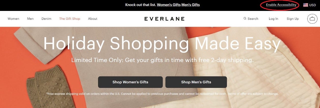
I’ve been living in a trailer for seven months wearing the same one week’s worth of clothes every day. Everything else I own is packed away in storage while construction is going on to make my house wheelchair accessible, and I hadn’t planned on still being here during winter. My fashion-forward oldest daughter suggested a sweater from Everlane, so I went there on Black Friday hoping to score a deal.
And then I saw it — “enable accessibility.” A flood of negative thoughts went through my mind.
Another overlay. Grr. Most people know what I think about those, and if you don’t, you can read any of these excellent articles from my Medium overlay list.
Haven’t they heard that separate but equal isn’t acceptable for people of color or anyone else? Read my article from about three years ago on the Scandinavian airlines case if you don’t know what I’m talking about. TL;DR — 100K fine for a website that implemented an accessible view via a sub-domain, which was against the Department of Transportation rules.
UsableNet just reported that more than 4000 accessibility lawsuits were filed in 2021, of which almost three-quarters were filed against e-commerce sites. E-commerce sites are the most complicated to make accessible because the existing codebase and content are constantly being modified. Products are continually added and deleted, advertising campaigns come and go, and retail sites usually have integrated third-party features like getting directions to physical stores or handling credit card payments. Any site that includes a shopping cart has multiple things happening during the checkout transaction, any one of which can be the source of a WCAG accessibility violation.
But then the more reasonable Sheri took over my thought processes, and so I clicked on the “enable accessibility” link to see what it would look like, bracing myself for the worst.
Instead, I was pleasantly surprised by the interaction. Once I hit enable accessibility, the continuously moving hero advertising slide carousel stopped moving. Additionally, the text over the pictures was replaced from the unreadable white text on an off-white article of clothing with black text on an opaque background layer between the text and the photos, creating a much clearer and more easily read experience.
UsableNet Assistive, the platform behind the “enable accessibility” approach, combines manual development work performed by UsableNet and deployment and release technology.
How is UsableNet Assistive different from Overlays?
One of the big problems with overlays is there is just too much that overlays can’t do that humans need to step in and fix. There are vast buckets of exceptions and things overlays don’t do well even though the overlay companies make claims to the contrary.
UsableNet Assistive does not rely on additional controls or pop-up panels to provide alternatives to inaccessible code. It also does not rely on automated fixes. Instead, UsableNet developers remediate all code to satisfy all WCAG success criteria. Their code changes update the client-side on-demand. That means no additional technology layer between the website and the users’ browser/assistive tech combo.
Bottom line: If you are on a website with UsableNet Assistive enabled, you still get to use YOUR assistive technology. You know, the stuff that you’ve spent hundreds of hours learning how to use and optimize!
UsableNet Assistive only initiates secure script calls to a PCI and HIPAA-certified service to make updates. It also remembers that you’ve chosen to enable accessibility mode. When you return to a website, you do not have to select that option again. A true “one and done,” unlike what the overlay companies claim.
Seyfarth Shaw uses UsableNet Assistive. They are one of the most reputable law firms with a practice focusing on the accessibility space. I can’t imagine that they would use an accessibility strategy that wouldn’t stand up in court.
How is the new UsableNet Assistive different from the “separate but equal” Scandinavian Airlines website?
UsableNet Assistive has made significant changes to its approach, addressing the core concern in the Scandinavian Airlines case. It doesn’t create a separate site with dual maintenance and remediation, which is a core concern. It isn’t a disability ghetto.
Users on sites that have implemented UsableNet Assistive always interact with the original website, including identical URLs, features, and services. UsableNet Assistive removed the proxy sub-domain requirement, so there are no changes in user data management, security, or server-side interactions.
Is Enable Accessibility an end state?
Not always. Jason Taylor, Chief Innovation Strategist for UsableNet, told me that 30–40 % of UsableNet Assistive customers transition from using that strategy to redesigning sites with accessibility in mind from the outset.
Conclusion
My rule is that if I get a question twice, I write about it. I’ve gotten way more than two questions about UsableNet Assistive and what I think about it. The most important thing is not to lump it into the unacceptable categories of “separate but equal” and “overlays” because it is very different from both. I had a couple of questions that came up when I interacted with sites that use UsableNet Assistive. UsableNet has been responsive in either explaining the behavior or fixing the issue. Their contact info is at the bottom of every page when “enable accessibility” is turned on, so you can’t miss it. From my experience so far as a sighted (I use magnification) keyboard-only user, UsableNet Assistive seems to be a reasonable approach to providing accessibility. If your experience has been different, please call that out in the comments with the name of the site and the issue you experienced, or DM me on LinkedIn.


