

Color Blindness Considerations for Designers and Content Managers
I recently read a Medium article on negative space published by a top design agency. The article had 5000 claps, so it was widely read. Unfortunately, the article’s primary example of good use of dark

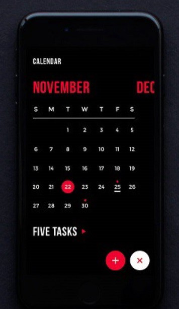
Calendar app where background color is black and important actionable components are red. Good use of negative space, but red on black is almost invisible to people who are color blind
Keep reading with a 7-day free trial
Subscribe to Access * Ability to keep reading this post and get 7 days of free access to the full post archives.